
Hi everyone! How are you today? I hope you’re well! ❤ Rain is pouring down from the sky like there’s no tomorrow, so much for what I thought was the beginning of nothing but spring! 😂 Whenever I see rain I remember the time when my sister and I were little playing outside and the downpour came out of nowhere and we had to run inside drenched only to see it was gone as quickly as it had come on! It was hilarious until we both caught colds as you do! 😐😂
Anywho! 😂 I recently randomly designed two new headers for my blog that are very similar and I really need your help deciding on which one to go with 😬 I’ve been excited to show them to you and would love to know your opinion as to whether or not I should stick to the logo I have right now or change over to start a clean slate for spring? 🌻 Here is the logo I am using at the moment:
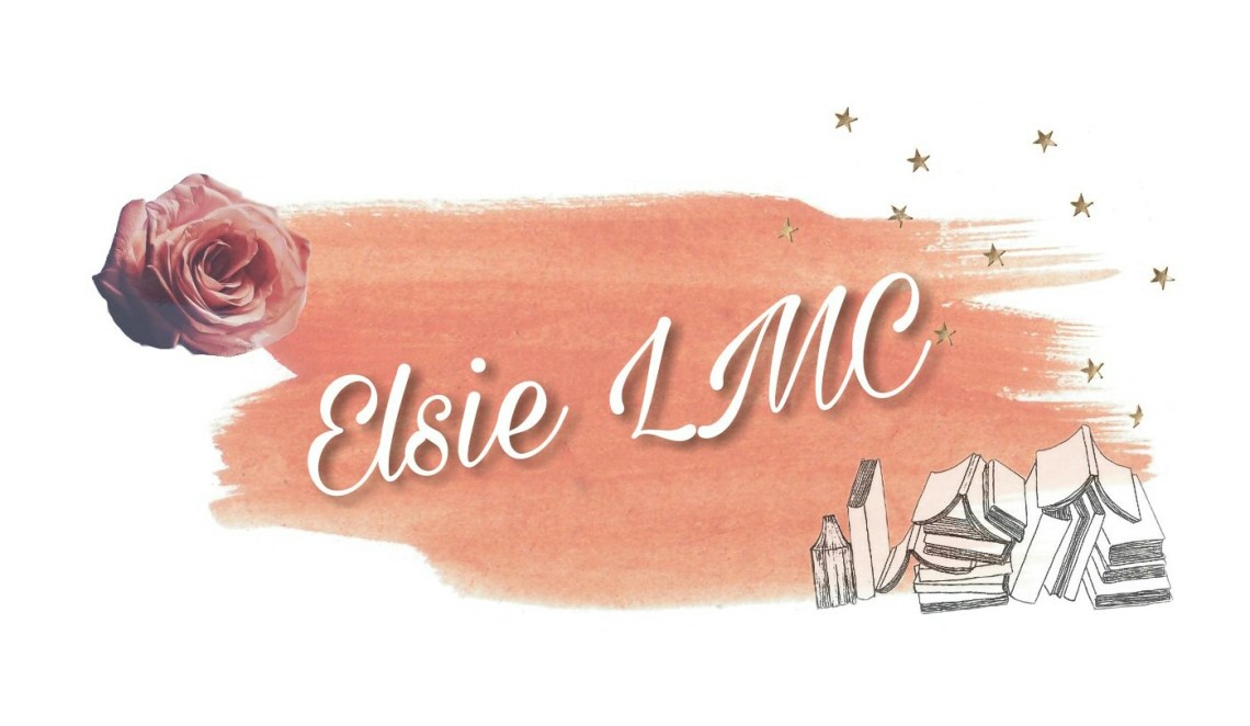
I still love it but I’m verging on the like side of love with it 😂 This has been up since September of last year and it feels like much longer than that so maybe it is time to consider something different 🤔 However I do still like how it looks at the top of my website!
……………………..
Here are the two new ones!! (A lot more excitement is directed towards them as you can tell! 😂). They are both floral and fairly simple, similar designs. The lettering in the first one is a duck egg blue and in the second image it is pink with a blue tint outlining it (that I can remove):
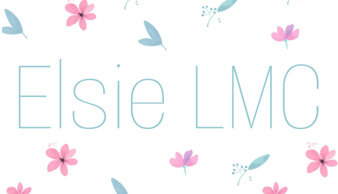

I’m so confused (It’s a nice type of confused though! 😂). They are a jump away from my logo at the moment but still in keeping with pastel colours. I feel like they are clearer looking but then maybe that makes them boring?? 😂 If I’m honest I’m leaning more towards the blue letters at the moment!
Let me know what you think I should do! 😉 I hope you’re having a lovely day! ❤


I like the blue lettering, but I think the shadow behind the pink really makes the words “pop.” Maybe try adding the shadow to the blue??
LikeLiked by 2 people
Thank you!! You’re right, I will try outlining it with a dark pink and see what it looks like! 😄❤
LikeLiked by 1 person
Ooh, that sounds like it would really pop!
LikeLiked by 1 person
I love all of them, but the blue flowery one is beautiful!
Tori | JustTheBeginning-x.com
Latest blog post: Primark Disney Haul!
LikeLiked by 3 people
Thank you!! 😄❤
LikeLike
I like both but the blue one draws me in more. I might be biased because I do like blue.😊
LikeLiked by 2 people
Thank you!! Haha 😄❤
LikeLike
😊
LikeLiked by 1 person
Blue one is more beautiful
LikeLiked by 3 people
Thank you!! 😄❤
LikeLike
Heyy! I can’t actually give feedback on the headers because I don’t have enough sight to see the photos but I’m sure they both look fab 🙂 It was so nice to hear you’ve been having a good time recently! xx
LikeLiked by 3 people
Thank you so much!! 🤗❤
LikeLiked by 1 person